
UX Research
Client
Archer IRM
Role
UX Research Consultant
Teams
- UX Team
- Marketing Team
Tools
- FigJam
- Otter.ai
Overview
ArcherIRM.com is the public-facing website for Archer Technologies, a global provider of risk management solutions. The site serves as a key introduction to Archer’s platform, helping potential customers understand the full scope of offerings, while also supporting current customers, partners, and internal stakeholders.

Starting Point
Archer embarked on a website redesign initiative after recognizing that the existing site, built on Wix, was no longer scalable or flexible enough to meet enterprise needs.
In particular, they wanted to:
- Understand stakeholder goals and pain points with the current site
- Identify gaps in content, navigation, and messaging
- Gather feature and functionality requirements to inform a user-centered redesign
What We Did
We conducted a robust stakeholder research initiative to inform the redesign strategy:
1. Research Plan Development
To ensure alignment across departments, we established clear research goals focused on understanding how the website supports Archer’s customer experience. This framework guided the methodology and kept the process transparent.
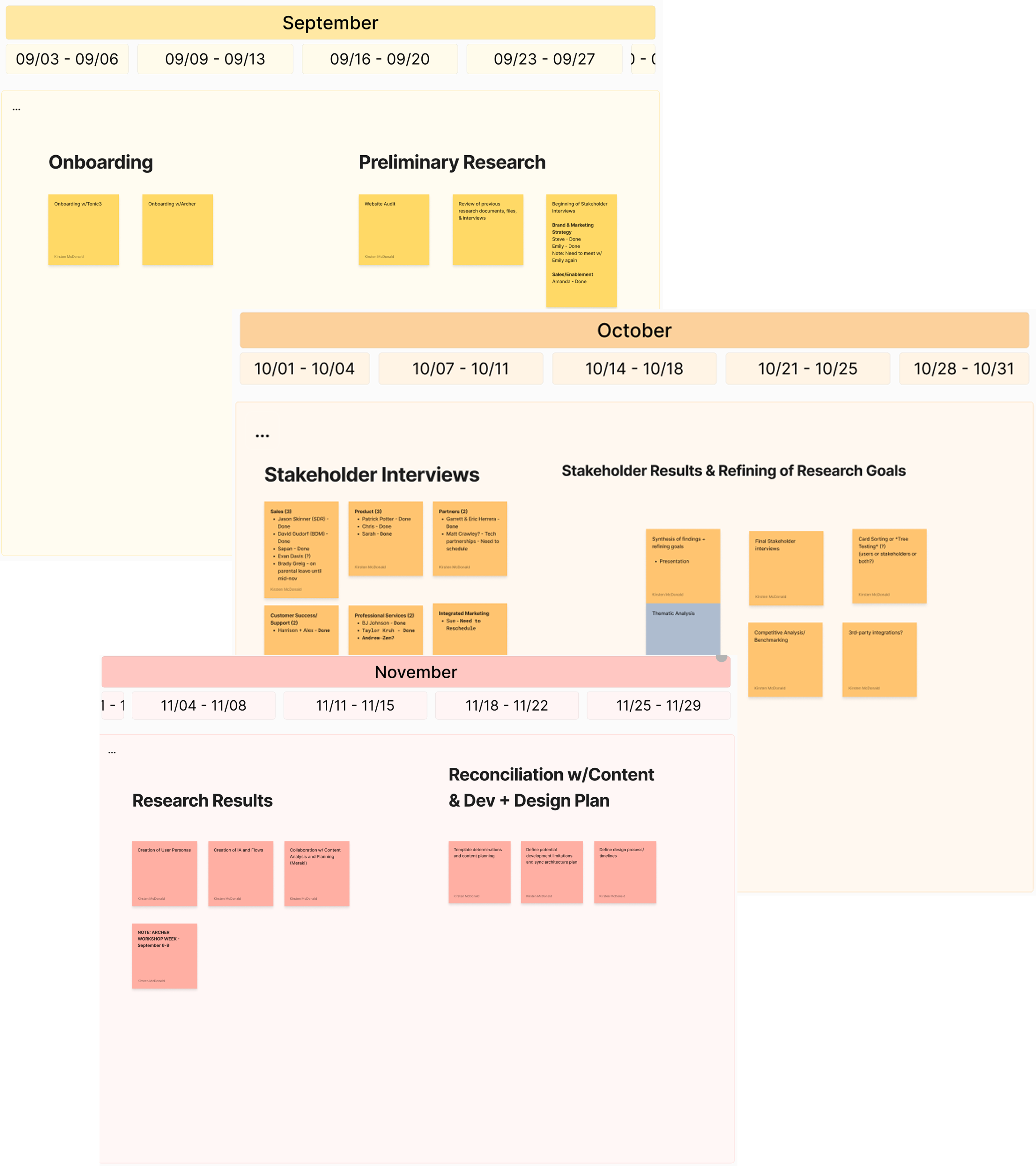
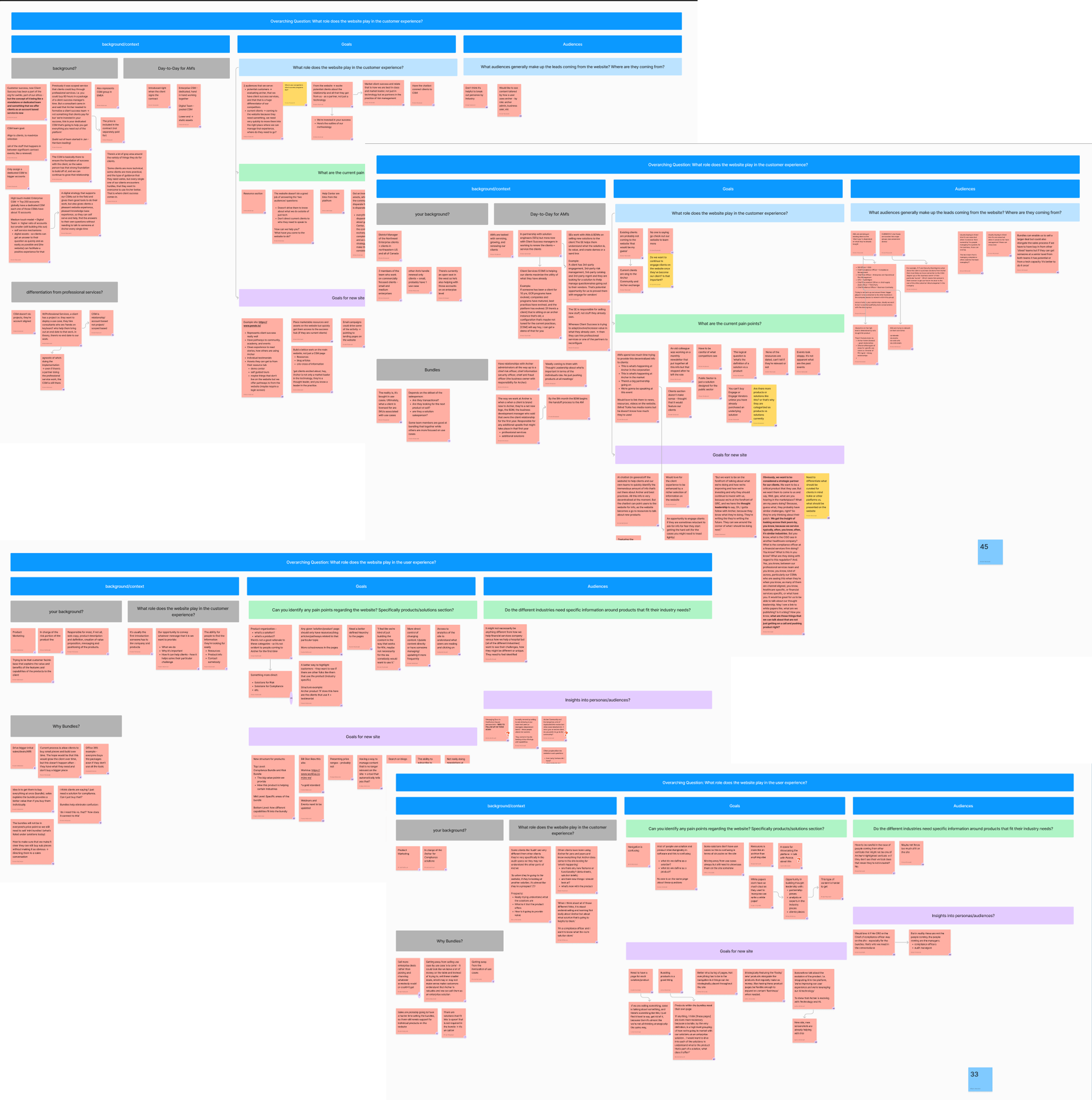
2. Research
We conducted 17 stakeholder interviews across 8 internal teams, including Sales, Product Marketing, Client Success, and C-Suite leadership. We also reviewed secondary research reports, performed a full website audit and competitor benchmarking.
3. Data Analysis
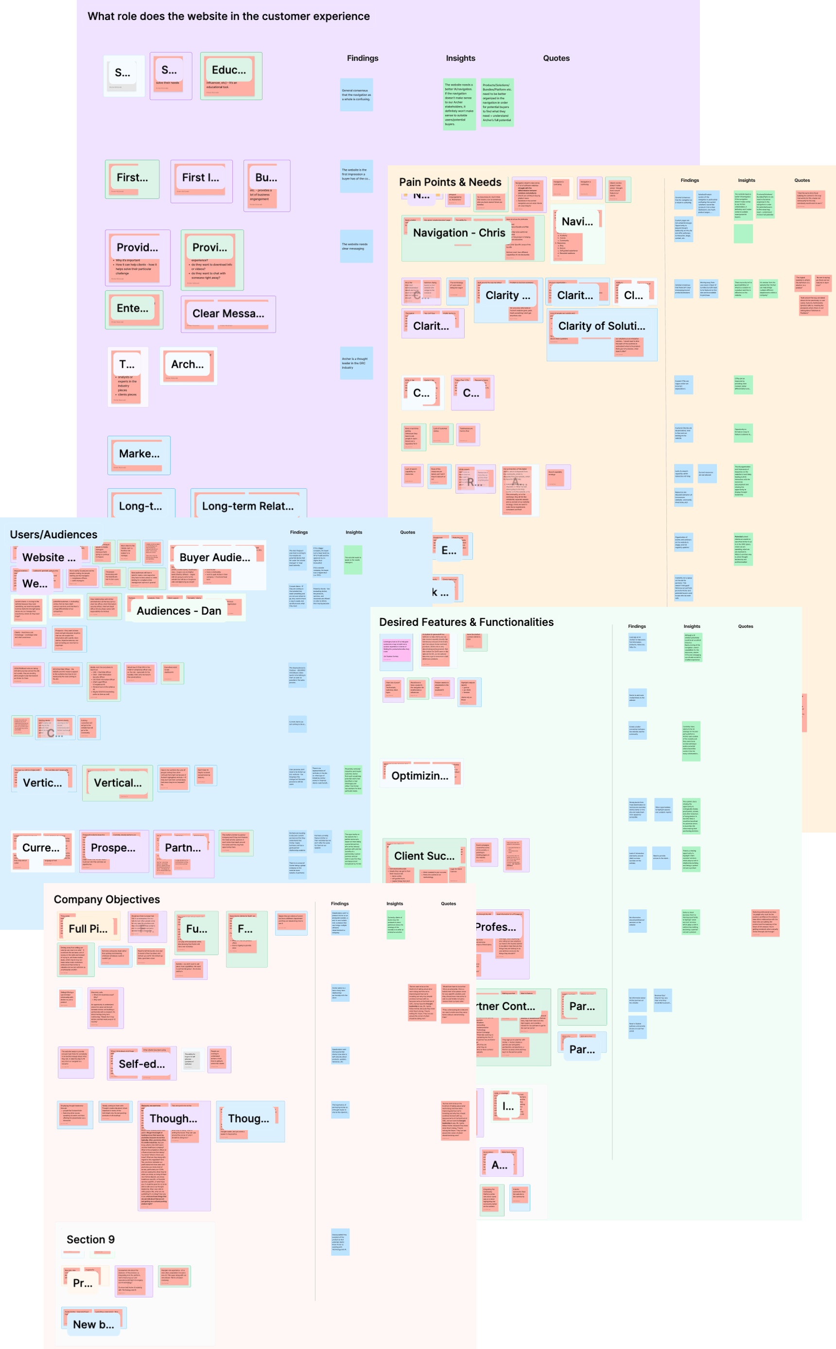
We applied affinity mapping to over 400 qualitative data points, clustering them into themes aligned with our research goals. This synthesis revealed patterns in how users interact with the site and how it could better serve its audiences.
Key Themes Explored
1. Navigation:
Stakeholders consistently described the current site navigation as confusing—particularly within the “Solutions” and “Products” sections. Users struggled to distinguish between these categories, often encountering jargon-heavy language and unclear pathways.
🔍 Insight: Even internal stakeholders found the structure unclear, which signaled that external users likely face greater friction. Navigation must be restructured to reflect a clear, intuitive information architecture.
2. Clear Messaging:
There was widespread agreement that the site fails to communicate Archer’s value as an enterprise solution. Current copy lacks clarity on what differentiates a “solution” from a “product” and how Archer serves as a cross-functional platform.
🔍 Insight: The website must articulate Archer’s positioning as a legacy leader and clarify how its offerings solve pain points across departments.
3. CTAs and Conversion:
Call-to-actions were flagged as vague, inconsistently placed, and not accessible. They often lacked context and didn’t align with users’ decision-making journeys.
🔍 Insight: CTAs should be redesigned for clarity, hierarchy, and relevance to user goals (e.g., request demo, contact sales, explore solutions).
4. Resources and Thought Leadership:
Stakeholders emphasized that the site underutilizes opportunities to showcase thought leadership. Resources were scattered across multiple platforms, lacked relevance, and weren’t searchable.
🔍 Insight: A centralized, searchable hub for articles, webinars, and analyst reports would reinforce Archer’s industry leadership.
5. Partnerships, Client Success, and Professional Services:
These service arms were nearly invisible on the current site. Several teams expressed concern that failing to highlight these aspects undermines Archer’s positioning as a long-term partner, not just a product provider.
🔍 Insight: Featuring these services prominently can help demonstrate value throughout the customer journey and differentiate Archer from competitors.
6. Customer Stories:
Stakeholders across departments requested that customer success stories, awards, and analyst validation be better featured throughout the site.
🔍 Insight: Social proof not only builds credibility but also supports the buyer journey for decision-makers.
Recommendations
Based on the analysis, we developed a series of targeted recommendations:
- Redesign the navigation and IA to reflect intuitive paths for potential buyers, current clients, and partners
- Clarify product vs. solution language and align with strategic messaging
- Create accessible, context-rich CTAs across high-traffic pages
- Build a centralized, filterable resource center showcasing thought leadership
- Introduce dedicated sections for partnerships, professional services, and client success
- Strategically embed customer stories and awards to build trust
Final Steps
These recommendations were shared with the UX, content, and development teams. Next steps include user testing, persona development, and information architecture workshops to validate concepts before execution. This redesign initiative will better position Archer to meet user needs, communicate value, and establish long-term relationships through a research-informed experience.