
User Flow Implementation & Design
Teams
- UI Design
- Project Management
- Development
Tools
- Figma
- InVision
Overview
The Scientific Citizenship Initiative is a program associated with Harvard Medical School that brings together a team of highly qualified scientists with the aim of fostering inclusivity and equality in scientific research.

Starting Point
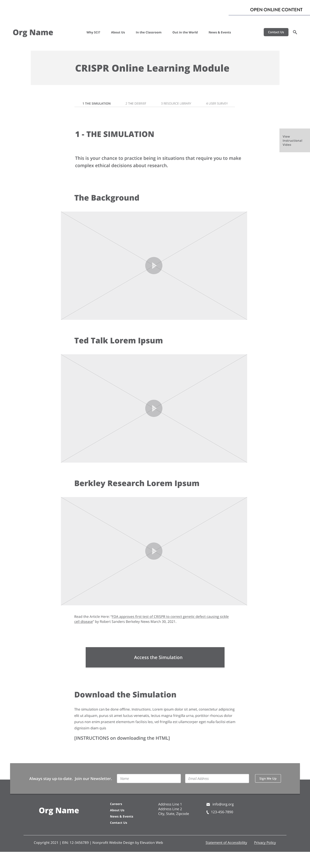
SCI wanted to create a simulation (learning module) that helped reveal the ethical complexity of biomedical research by putting users in the role of a scientific researcher and requiring them to make choices about their research agenda. The main challenges were:
- To create a user flow that followed conversational patterns that felt natural and offered contextual information.
- To strategically collect user data to further analyze and validate their inclusivity and equality efforts.
- To have users engage with additional resources after the completion of the simulation.
Solution Implementation
To create a rich yet simple design solution, I took the following steps:
1. Providing Context
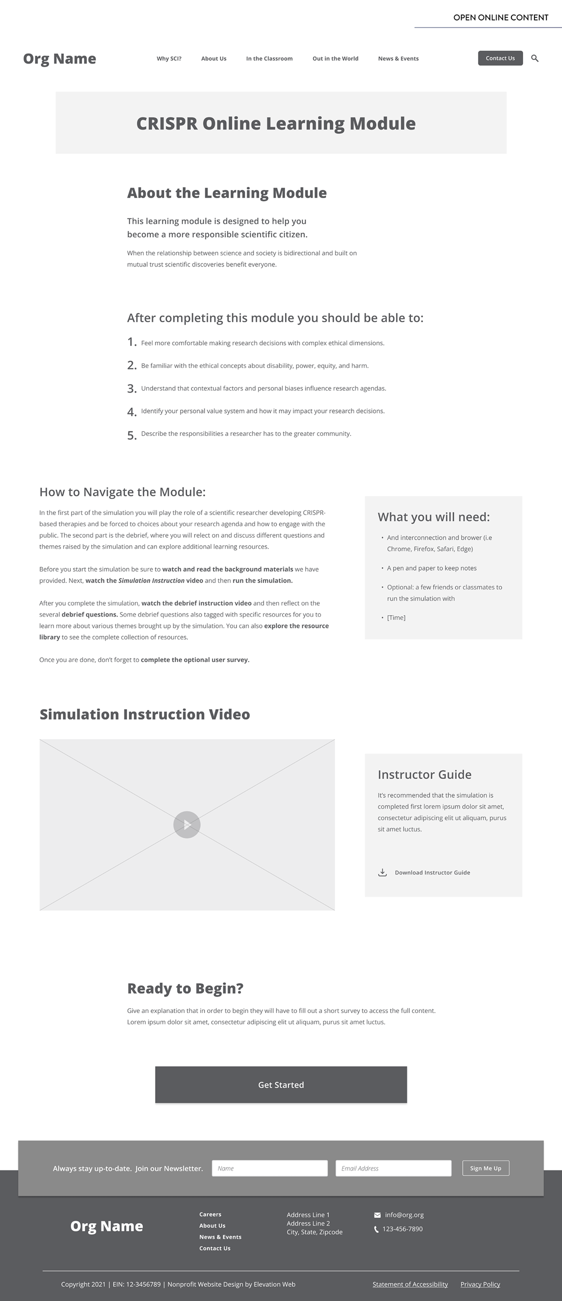
To give users the appropriate context for the simulation, I outlined an overview of the learning module through key takeaways, navigation guidance, and an instructional video.
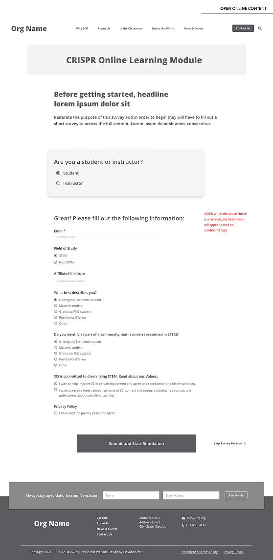
2. Gathering Data
Gathering essential data was crucial for the stakeholders. To do this, I created a brief survey at the beginning of the module that featured select questions. I tailored the questions based on user identification as an ‘instructor’ or ‘student’ to ensure relevance. This approach guaranteed data collection while also retaining users at the on-start of the module with a concise survey to reduce user drop-off, versus initially presenting them with the more comprehensive survey that the client desired. The rest of the design would gradually guide the user to the extensive survey as part of the user journey.
Learning Module Overview
Wireframe
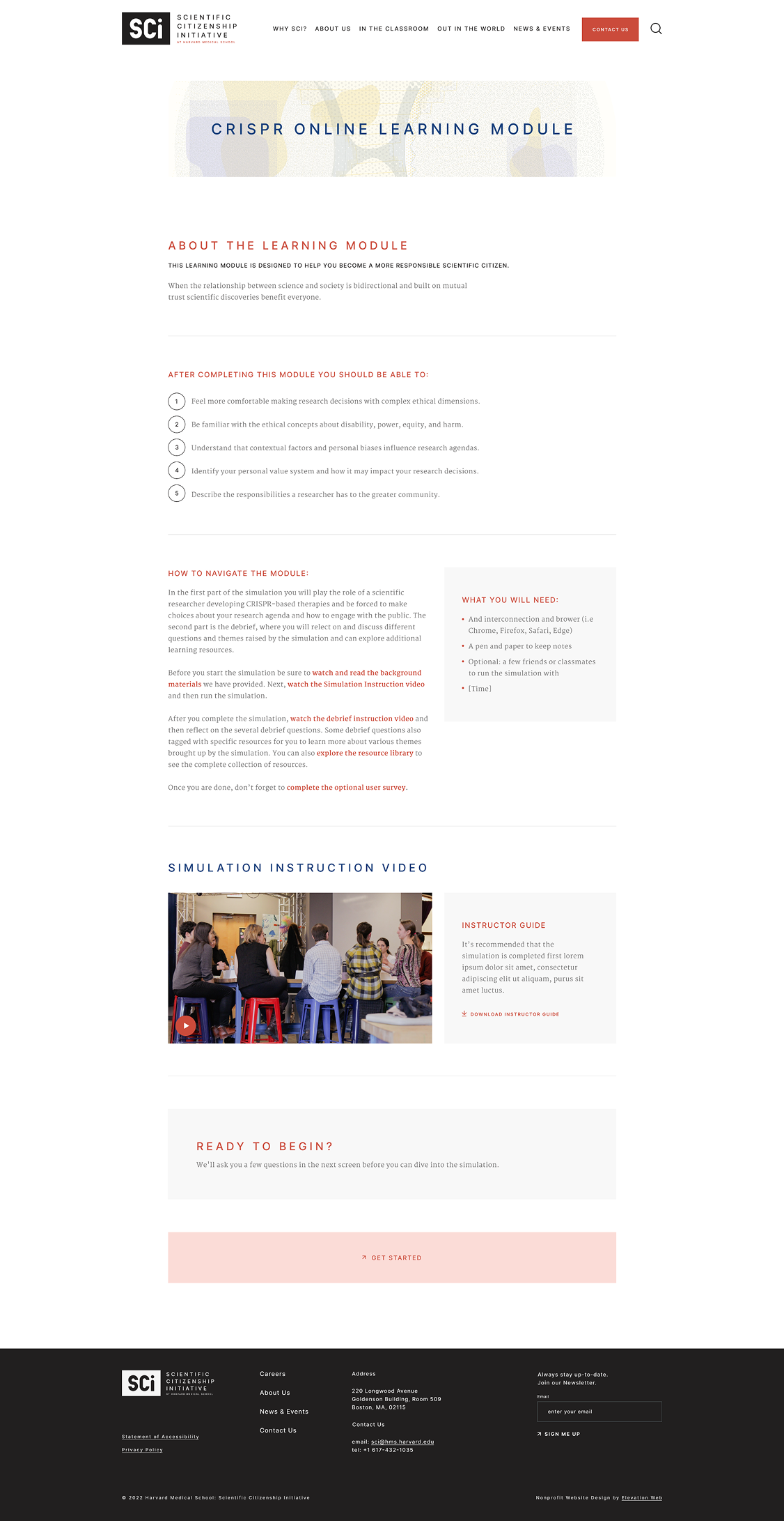
Final Design
Brief Survey
Wireframe
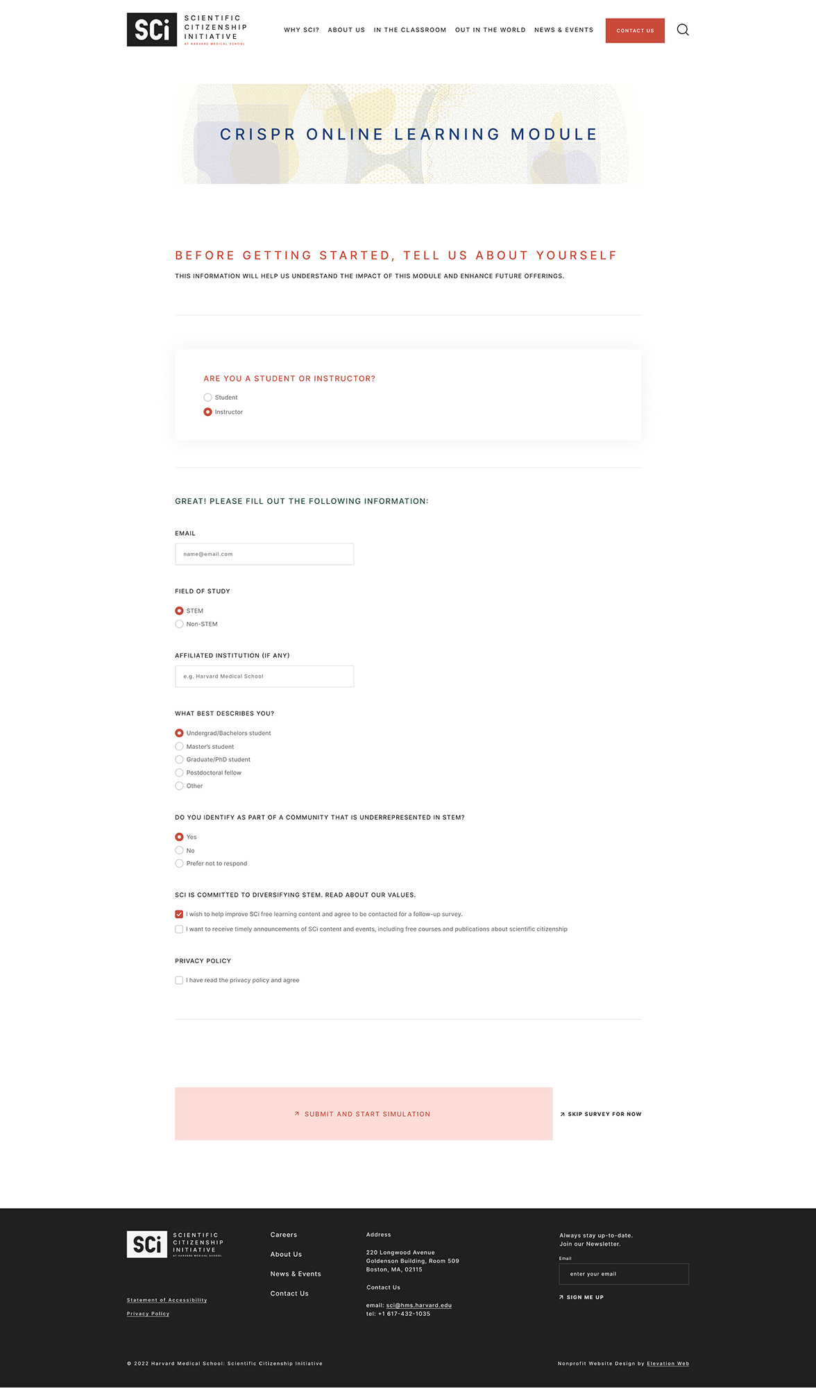
Final Design
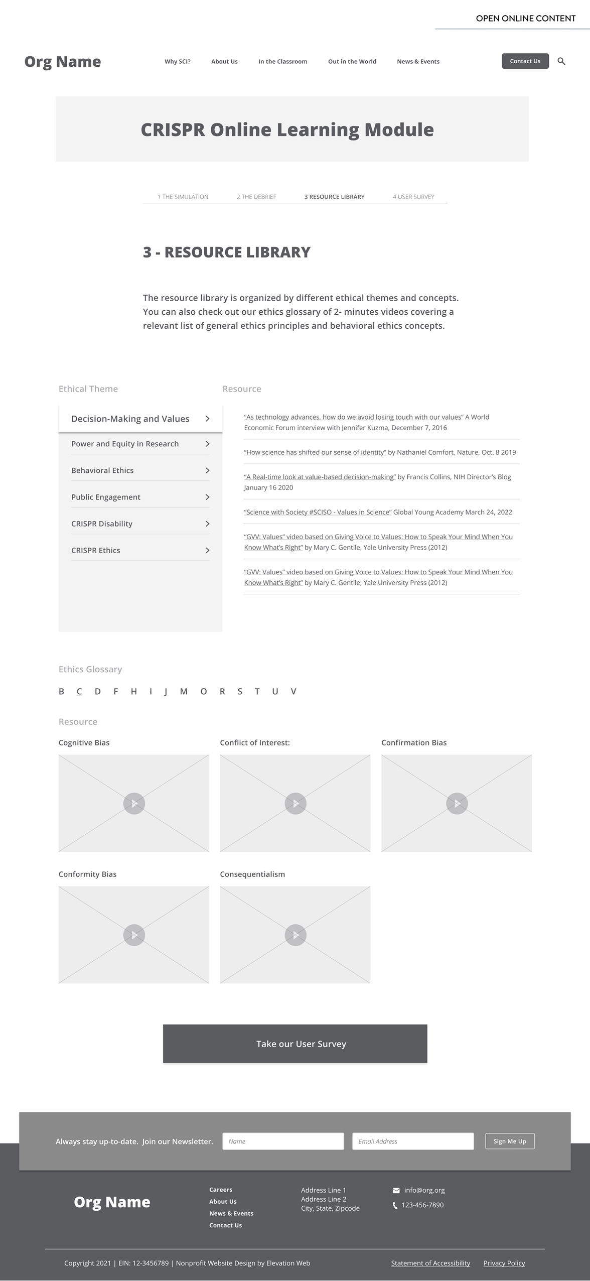
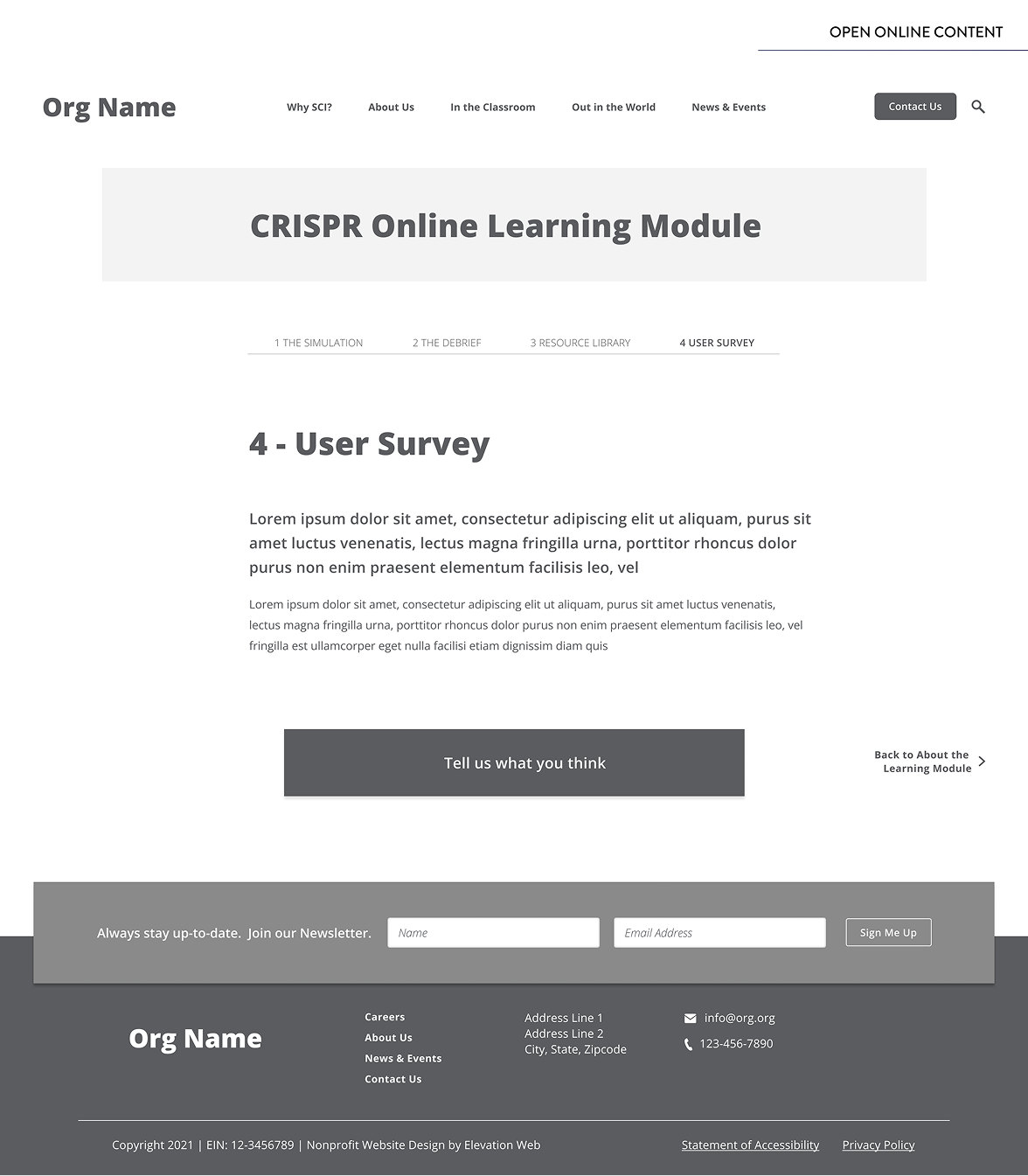
3. The Learning Module
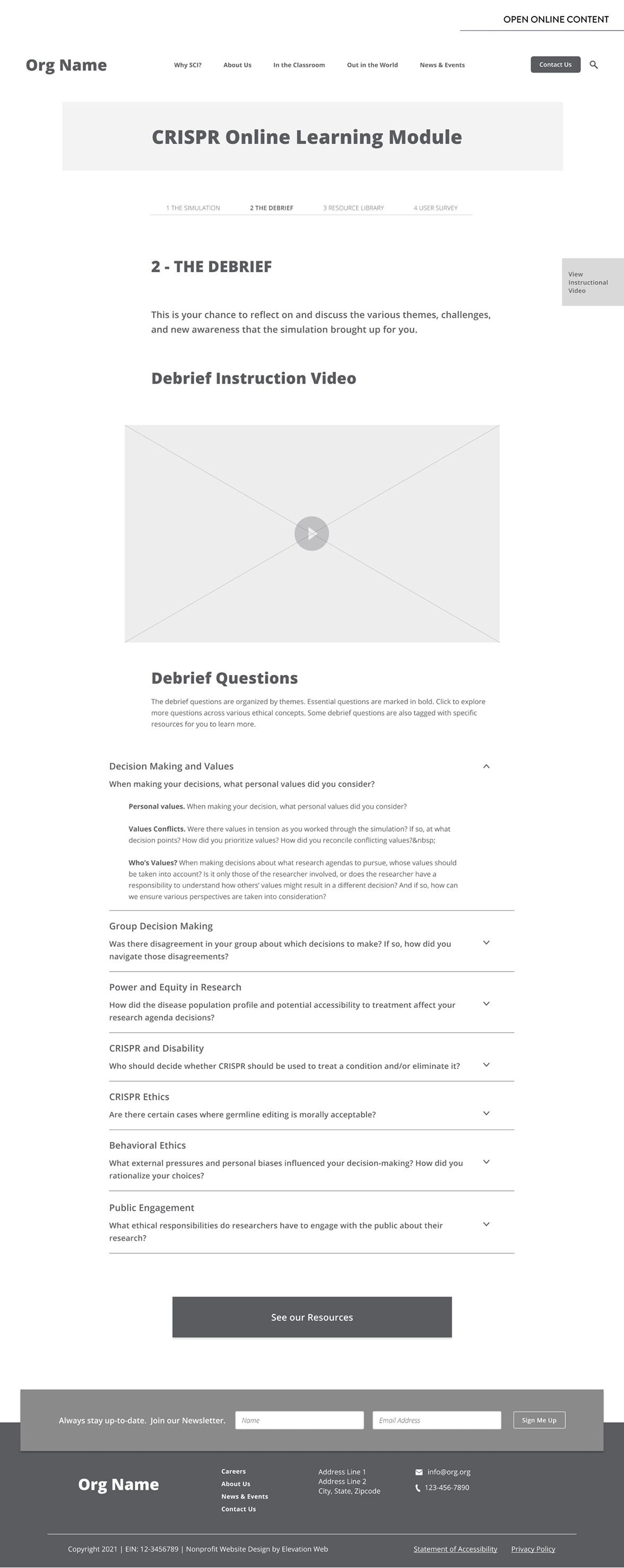
Although the simulation was hosted on another platform, the client wanted users to return and continue engaging with the learning module after the simulation’s completion. This included a debrief, finding additional resources that were related to the simulation, and completing the more comprehensive user survey.
To translate this into a cohesive design and to ensure that users engage with all elements of the learning module, I divided it into four sections and provided a step-by-step progress bar to give users better navigational control. The progress bar made each part of the learning module more accessible while also maintaining a sense of a progressive user journey. This was done in consideration of a use case scenario where a user may have already completed the simulation but want to visit the additional information at a later point.
Finally, we presented the more in-depth and complete user survey at a point when users already understood the value and context of the simulation in order to boost conversion rates.
The following images represent the wireframes and final UI design for the four sections of the learning module:
- The Simulation
- The Debrief
- Resource Library
- User Survey
1 – Simulation
Wireframes
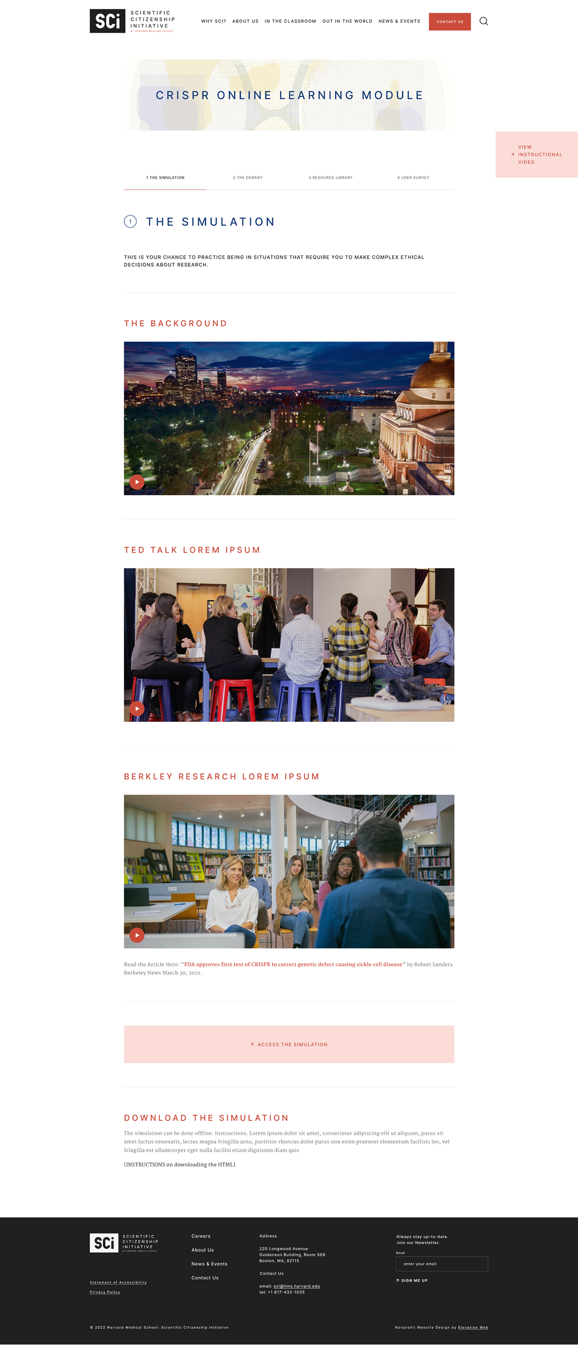
Final Design
2 – The Debrief
Wireframes
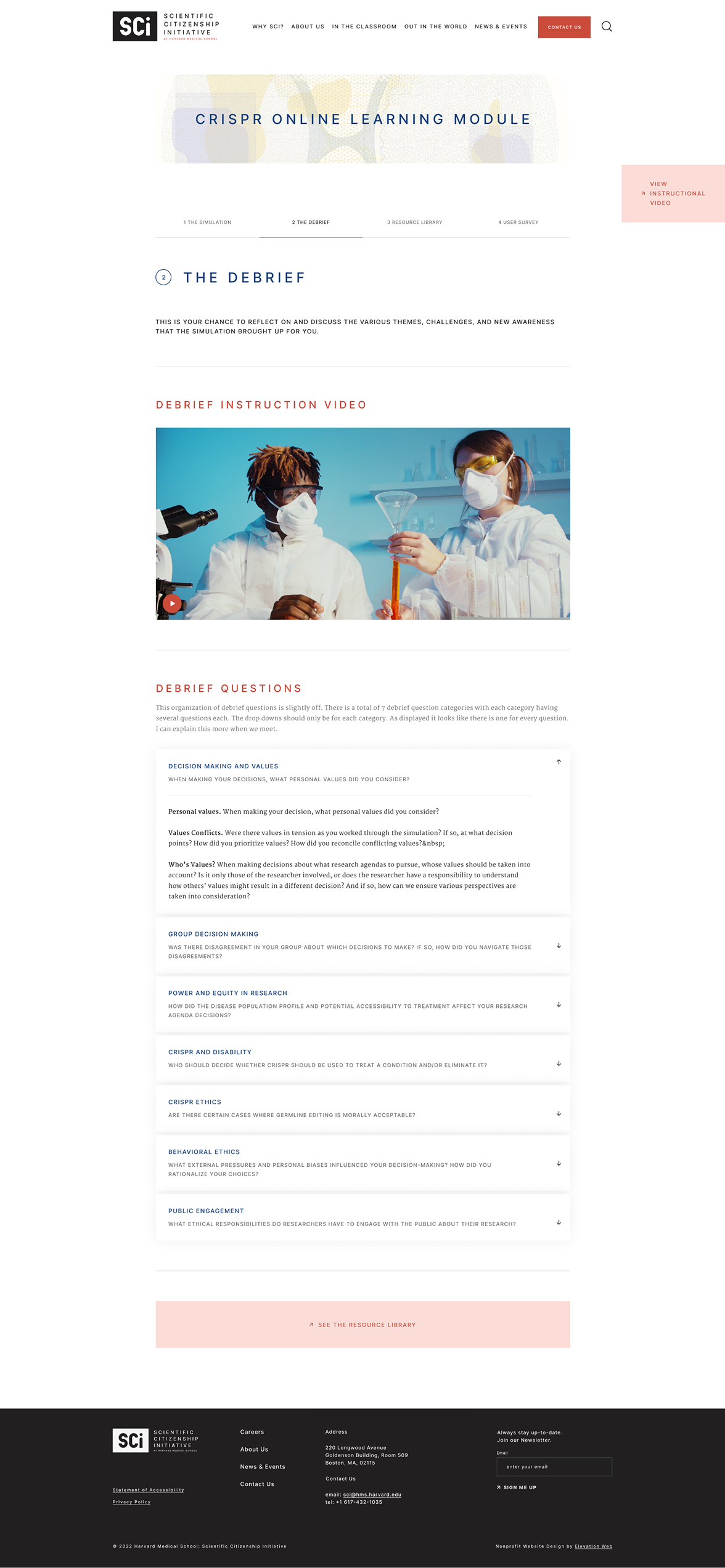
Final Design
3 – Resource Library
Wireframes
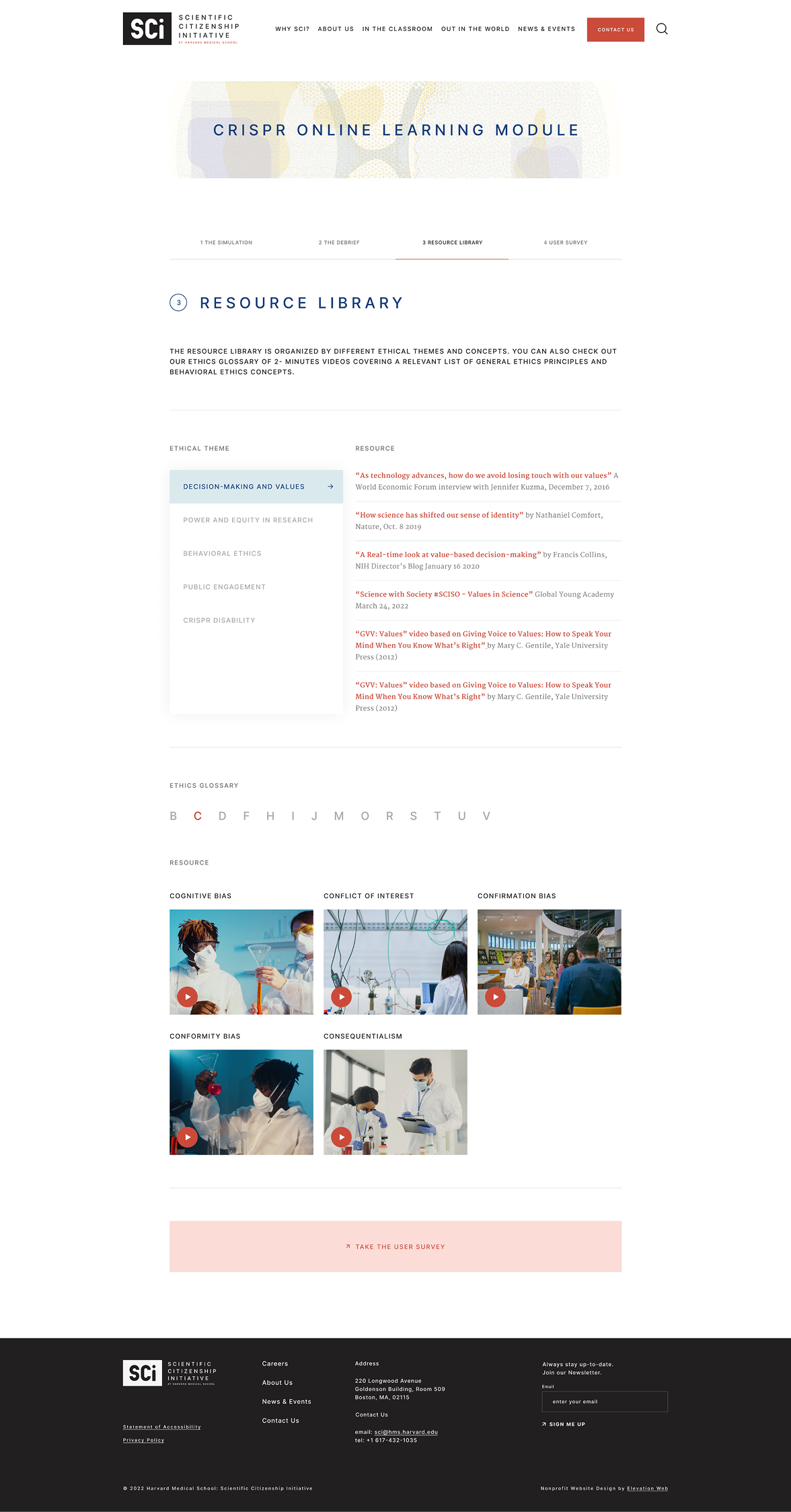
Final Design
4 – User Survey
Wireframes
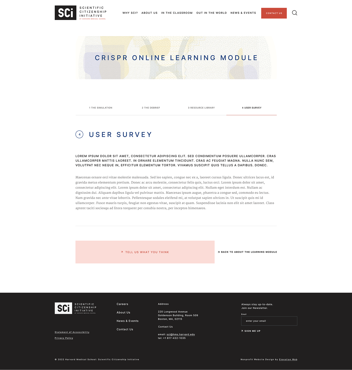
Final Design
Conclusion
The final result was a comprehensive learning module with a introduction page to provide context, a short initial data collection survey, and the four steps that included the simulation, the debrief, learning resources, and the in-depth user survey.